 The New York Times this week has an article on the different typefaces used in this year’s election signs. When I was in California a couple of weeks ago, Carly Fiorina’s campaign signs caught my eye. They looked hot pink–a remarkable choice in the usual primary-color palette of political signs–though a Google search tells me that they are actually red. (Maybe they were just faded from the hot Sacramento sun.) The other thing that I noticed was the typeface. Apparently it is Futura Light, which isn’t a great choice, with the really round ‘c’ and ‘a’ versus the really tall and thin ‘l’, but I did enjoy that someone was using something at least a little different from the too-common Impact and the like.
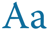
In other typeface news, I just got a new typeface, Warnock, for a new book. It is a great complete set: small caps, alternate characters, old style figures (why don’t more fonts come with these?), Cyrillic characters (one of my requirements, as small parts of the book are in Russian). It’s a much more modern (relatively!) typeface than I usually use. Adobe has a really nice specimen book available for download as PDF that shows the different weights and all of the characters that are included. With all of the swash caps and alternate characters, it’s a nice reference, though the same information will be available in the much-used Glyphs panel in InDesign.