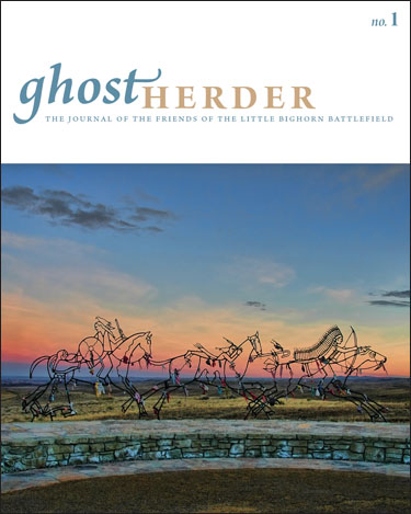
 Seems like I’ve been posting a lot of covers lately! Here’s another one, for a new journal just published by the Friends of the Little Bighorn Battlefield, called Ghost Herder. The striking cover photo was taken by Bob Reece, the journal’s managing editor, and shows a sculpture at the battle site. This issue has a lot of really wonderful photography, both current and historical.
It has been several years since I last designed a new journal from scratch, and it was a really fun challenge to design pages that would make the most of the current text, yet remain flexible for articles in future issues. I had to make decisions about how to treat different-sized illustrations, where to place the captions, how the footnotes should look, and how to lay out the table of contents–the critical first page. The same principles applied to the cover design: it has to be able to adapt to portrait-oriented (as opposed to landscape-, as with the current cover) images, so I did several samples using different images as practice. (The masthead color will change with each new cover.)
Because it was a new publication, we were able to choose a size (8 x 10 inches) that would allow for bleeds, which means an image can go all the way to the edge of a page rather than leave a 3/16-inch margin of white, unprinted space on all sides–with the photos that the Friends editorial board came up with, I wanted to make them as big as possible!