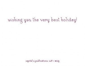
One of the things that I love to play with is the different glyphs that come in a well designed font. Here’s an example, from the inside of this year’s Christmas cards.
 This typeface, Feldman Engraver, has lots of nice alternate letters: see how the ‘h’ in ‘wishing’ is different from the ‘h’ in ‘the’, and the ‘a’ in ‘capital’ is different from the ‘a’ that follows.
Other examples of alternates include ligatures for letter combinations like ‘fi’, ‘ft’, and ‘ff’, lining and tabular figures, and small caps (like in ‘LLC’ here). It takes extra time to do this, but it’s one of the subtle things that elevates type into a really special design.