While archiving some files the other day, I remembered a few projects that I hadn’t written about last year. The first one is the design for Through Indian Sign Language: The Fort Sill Ledgers of Hugh Lenox Scott and Isseo, 1889–1897, edited by William C. Meadows.
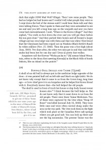
Shown on the page on the left, the arrow sketch (taken from one of the illustrations) is a design element throughout.
This project was a little different because of the way the author wanted to call out some notes, shown on the image to the right. The wavy line was inspired by a different arrow sketch, which had a wavy line running down the middle. It was complicated to lay out, but the final project turned out very nice! We also had to use a different typeface than usual, because the text required many glyphs that were only found in this one, which was designed with phonetic symbols.
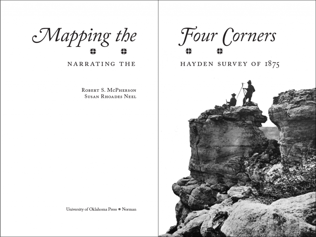
I just loved how this title page for Mapping the Four Corners: Narrating the Hayden Survey of 1875, by Robert S. McPherson and Susan Rhoades Neel, turned out! It is nice to use the full page spread—emblematic of the wide scope of the survey—for a change. The image was just dynamite, with the silhouettes of the surveyors on top of the cliffs. I also chose the four-piece ornament because it literally had four corners meeting up in the center!
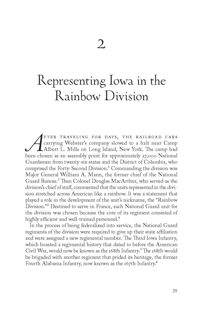
Here is a page from Somewhere Over There: The Letters, Diary, and Artwork of a World War I Corporal, by Francis H. Webster and edited by Darrek D. Orwig. The time frame of this book is much later than my usual topic, and I wanted the display type to be a little bit special for a book about an artist. I chose Oneleigh because it had some flourishes to make it look distinctive but was not too full of flourishes. Also the way the ‘g’ was drawn was similar to how the author wrote the ‘f’ in his name on his cartoons.
This book has a color section showing some of Webster’s artwork; they are stunning!
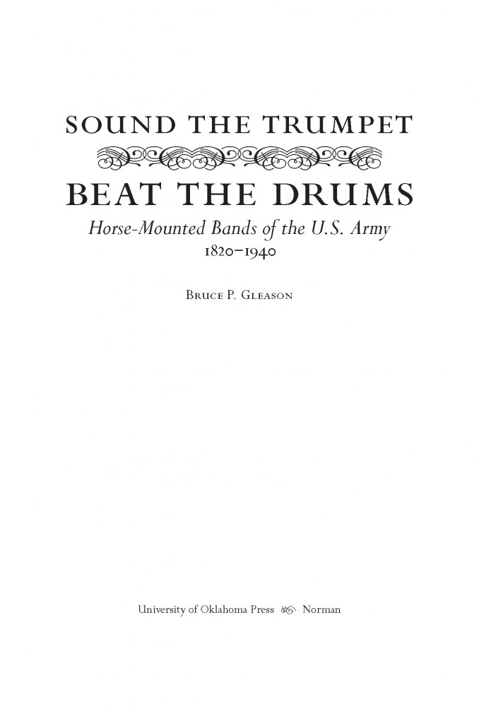
Another title page with ornaments (this one for Sound the Trumpet, Beat the Drums: Horse-Mounted Bands of the U.S. Army, 1820–1940, by Bruce P. Gleason), which the production manager at OU Press declared to be lyres—how perfect for a music book! Linking them up into that long row reminded me of the lines drawn for music notes.
