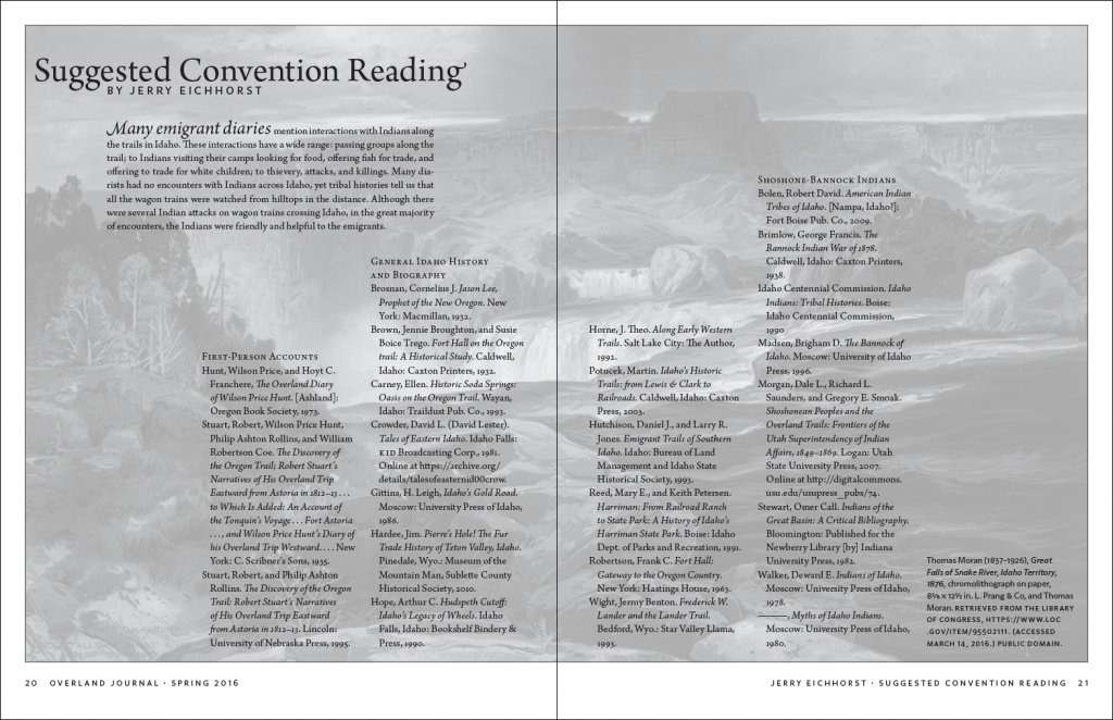
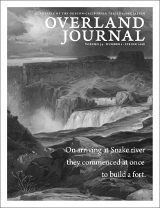
In the last post, I talked about the cover image and how I’d initially planned to wrap it around to the back cover. One of the aspects of the new design is putting more emphasis on the great images that we run. The reading list for the upcoming conference is a good example of that. Rather than just set a plain list, I put the full, glorious cover image across the two pages, then converted it to grayscale and screened it back so the text was still legible. It’s a fairly subtle effect, but it creates a sense of continuity with the cover and also means that readers do end up seeing the full image.
One thing that we are continuing from the previous design is the mailing wrap, with a quote from one of the articles. The one for this issue could not have been more perfect, as all of the articles are on the area around Fort Hall, which is on the Snake River.
The feedback from the new look has been very positive, including this note from the editor:
The issue is grand!

