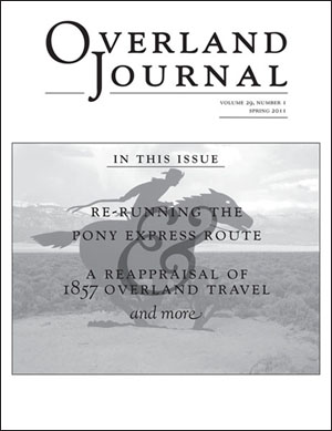
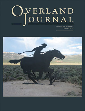
 The spring 2011 issue of Overland Journal came out last month; here is a look at its mailing wrap. We started using a mailing wrap on OJ a couple of years ago. Prior to that, we did the mailing address and postal information on the back cover. However, the U.S. Postal Service proved to be really hard on our journals in transit, and readers were receiving copies with their covers barely hanging on. The mailing wrap–basically an additional white cover made of some non-coated paper stock–has helped solve that problem. The design for it is fun to do, in that we get to be a little creative in designing the text (I love to do a big swirly ampersand wherever possible!). It’s printed in one color, and we have the cover image in grayscale, either lightened with black text or darkened with white text.
 As you can see, the masthead and image are aligned on both the wrap and the cover, so when you turn the wrap page, voila! the lovely full-color version of the photo. This photo of a Pony Express marker in Schellbourne, Nevada, is by Melody Miyamoto, whose article on traveling the route of the Pony Express (celebrating its 150th anniversary this year) is featured in this issue. The background and masthead colors are taken out of the image; I am particularly fond of the near-black with cream (and just happens to be the paint scheme on one of my favorite houses in my neighborhood!). I was concerned that the back cover, which is a solid near-black, might end up with banding, but it looks just great.