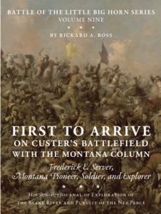
 This week we received printer’s proofs for a new book, First to Arrive on Custer’s Battlefield with the Montana Column. We edited this book as well as did the design and production. The work is based on the life of Frederick E. Server, great-grandfather of the author, Rickard A. Ross. Server was the first of his family to settle in Montana, which became his home after serving there with the Second U.S. Cavalry. Server started a generation of Montana pioneers, which brought this work to life. Ross dedicated the book to the “descendants of Montana Pioneers and those who continue to make the Big Sky Country their home.” While copy-editing the book, I recognized areas the author described in Montana, most of which I had been to on my seventh-grade Montana history trip. One such place was the Little Bighorn Battlefield, where I distinctly recall being extremely cold from the frigid gusts of wind we couldn’t shelter from. But when you’re in seventh grade, wearing a coat just isn’t cool, so I continued to shiver without thoughts of putting on a jacket.
En Dash versus Em Dash
I helped edit the beginning of this book last spring. For me, the main focus of this project was learning what an em dash versus an en dash is and when to use them. When you see a dash in text, you recognize it, know that it needs to be there for literary purposes, and you move on. Not in this case. Have you ever noticed that some dashes are longer than others? I hadn’t, but now I can certainly find a difference between them. When using the the en dash with numbers, the dash means ‘up to and including’ unless the number range doesn’t have a definite ending. Also, the en dash is preferred as a minus sign when typing mathematically and in scientific writing. However, writers are cautioned by the Chicago Manual of Style to use this form of dash sparingly for its lack of elegance. This is a normal dash or hyphen: – This is an en dash: – See the difference? The en dash is approximately the width of an N and slightly longer than a hyphen. It can be used in place of the word ‘to’ or in an open compound. Example: 2010–2011 or post–Civil War. In order to make an en dash, hold down the ALT or option key while pressing the hyphen key. This is an em dash: — An em dash is the width of an M. An em dash may replace a comma, semicolon, colon, or parenthesis. This type of dash is more common. The em dash adds emphasis or signals an interruption or change of thought. Example: Please read this blog—or don’t—but I’d love if you did. To make an em dash, hold shift, option, hyphen or hold ALT while typing 0151.
Consistency
Consistency was a huge lesson in this text as well. I learned that you can put just the last name of the person whom you are referring to after originally introducing them. You have probably noticed this style in newspaper articles. For example, after saying ‘Frederick E. Server’ once, you can simply write ‘Server’ in the following lines. Also, if there is a title to the name, like lieutenant, that only needs to be mentioned initially as well.
More Info
The book will be available this fall in trade and limited editions. If you wish to purchase a copy, check out Upton and Sons Publishers and Booksellers at: shop.uptonbooks.com. Next week I am hoping to conduct an interview with the Uptons and post the results!
![Dead Sea. Man with book and sunshade floating to show bouyancy [i.e., buoyancy]](http://www.capitala.net/live/wp-content/uploads/2011/01/23180u.jpg)