A good review

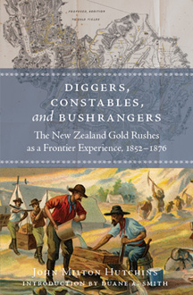
A past Capital A project, John Hutchins’s Diggers, Constables, and Bushrangers, got a good review from the Journal of Australasian Mining History (vol. 10, 2012):

Hutchins’ book has the added value of clearly placing New Zealand as a small but significant link in the international sequence of nineteenth century gold rushes.

See also this post by Jonna about this book from a couple of years ago.

Posted in books | Tagged , | Leave a comment

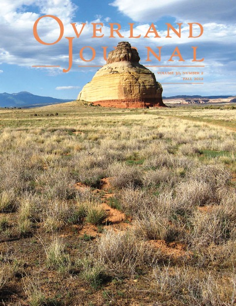
A little twist on the cover

Inspired by the covers of women’s magazines, I let the subject of the cover illustration take center stage, blocking out part of the masthead. It’s a glorious image!

Posted in journals | Tagged , , | Leave a comment

New Upton book compiles Little Big Horn literary gems

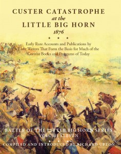
Capital A recently worked on the design and production of the latest Upton & Sons book. Richard Upton compiled Custer Catastrophe at the Little Big Horn, 1876 from nine chapters that were originally published in smaller forms, often not with the intention of educating a larger audience in mind. Through the years, these stories have become more and more obsolete, and copies are nearly impossible to find.

Various battle accounts

An account of the Battle of the Little Big Horn written from the point of view of Cheyenne chief Two Moon offers a rare and intriguing tidbit for readers, as “Indian accounts during this period were usually looked upon with skepticism,” Upton points out in the introduction of the book.

Chief Two Moon does not like to detail the battles he went through, but is amiable when approached for the interview:

While he cut his tobacco Wolf Voice interpreted my wishes to him. I said, “Two Moon, I have come to hear your story of the Custer battle, for they tell me you were a chief there. After you tell me the story, I want to take some photographs of you. I want you to signla with a blanket as the great chiefs used to do in fight.”

Wolf Voice made this known to hi, delivering also a message from the agents, and at every pause Two Moon uttered deep-voiced notes of comprehension. “Ai,” “A-ah,” “Hoh,”—these sounds are commonly called “grunts,” but they were low, long-drawn expulsions of breath, very expressive.

Then a long silence intervened. The old man mused. It required time to go from the silence of the hot valley, the shadow of his little cabin, and the wire fence of his pasture, back to the days of his youth. When he began to speak, it was with great deliberation. His face became each moment graver and his eyes more introspective.

“Two Moon does not like to talk about the days of fighting; but since you are to make a book, and the agent says you are a friend to Grinnell, I will tell you about it—the truth. It is now a long time ago, and my words do not come quickly.”

He says he and the other men all thought the fighting was done after their battle at the Rosebud. A couple days later, a messenger gave them other news, and said, “Let everybody paint up, cook, and get ready for a big dance.”

Another example of rare information

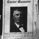
The original cover of A Story of the Custer Massacre.

According to Upton, only twenty copies of Jacob Adams’s A Story of the Custer Massacre, another account reproduced in this volume, were ever printed, so Custer Catastrophe holds a unique opportunity to read this first-hand account that not many people have been in contact with.

Adams, who was on the frontier for seven years and spent five years with the Seventh Cavalry, writes his book in a very straightforward manner, displaying his confidence and character throughout his rendition of the battles the unit faced. One particularly telling scene of Adams’s persona comes when he details an expedition he participated in at the mouth of the Powder River:

“When we arrived there about June 15th, 1876. We laid down for a few days evidently waiting for something. In the meantime a half breed Sioux Indian came to our camp declaring that he had deserted Sitting Bull’s camp and wished to join our camp. General Custer trained him for a scout. This half breed Sioux was a spy and betrayed General Custer. He rode at the head of the column with General Custer and as I claim was a spy and the reader will claim so too after they read this book.”

Details, straight from the source

Along with the stories of the fight and the interviews with different people who participated in the battles, the last section of this compilation is Comments by General Fry on the Custer Battle, which is an interesting read about the actual details of the battle. While much myth and lore surrounds the battles during this time period, General Fry tells readers what happened from his perspective.

He points out the odd statistics that affected the battle with an official report of 1876: “Up to the moment of Custer’s defeat there was nothing, official or private, to justify an officer to expect that any detachment would encounter more than 500 or 800 warriors.” In fact, the Custer fight was made up of 2,500 to 3,000. Though the failure of the battle has been attributed to “departure from the ‘plan,’” General Fry says, “the utter failure of our campaign was due to underestimating the numbers and prowess of the enemy.”

Book info

Upton & Sons, Publishers · Copyright 2012 · ISBN 978-0-912783-49-9
Trade Edition $55.00 · Signed, numbered, specially bound limited edition (only 50 copies) $150.00
Posted in books | Tagged , , , , , , , , , , , , | Leave a comment

St. Louis steamboating

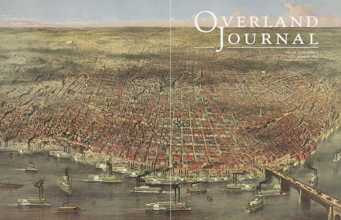
Overland Journal Summer 2012 coverHere is a peek at the cover of the summer 2012 Overland Journal, which uses a scene from St. Louis circa 1874 to illustrate an article on the importance of steamboats in the overland era.

The image was quite big and very beautiful, so rather than run it small enough to fit the whole thing on the front cover, I went big and wrapped it around to cover the whole back cover, too. (The dividing line between the front and back is shown here as a thin white line.)

Posted in journals | Tagged , , | Leave a comment

Basic, yet vital

From The New York Times, a roundup of some common comma mistakes. I see these constantly on professional websites that clearly have never been copy-edited (a whole other problem!). They are really simple lessons–learn them, and give me one less thing to mark in red on your manuscript!

Posted in Uncategorized | Leave a comment

Gold in exchange for steel

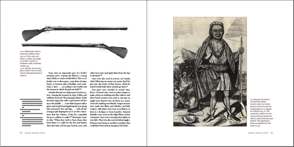
Excitement reigns in the quaint office of Capital A this morning. Firearms of the Fur Trade: The Encyclopedia of Trade Goods, Vol. 1, a book we worked on for an extended period of time, won Gold for the 2012 Independent Publisher’s Book Award reference category. Dr. James A. Hanson and Dick Harmon did an excellent job writing and compiling the book before we put our skills to work.

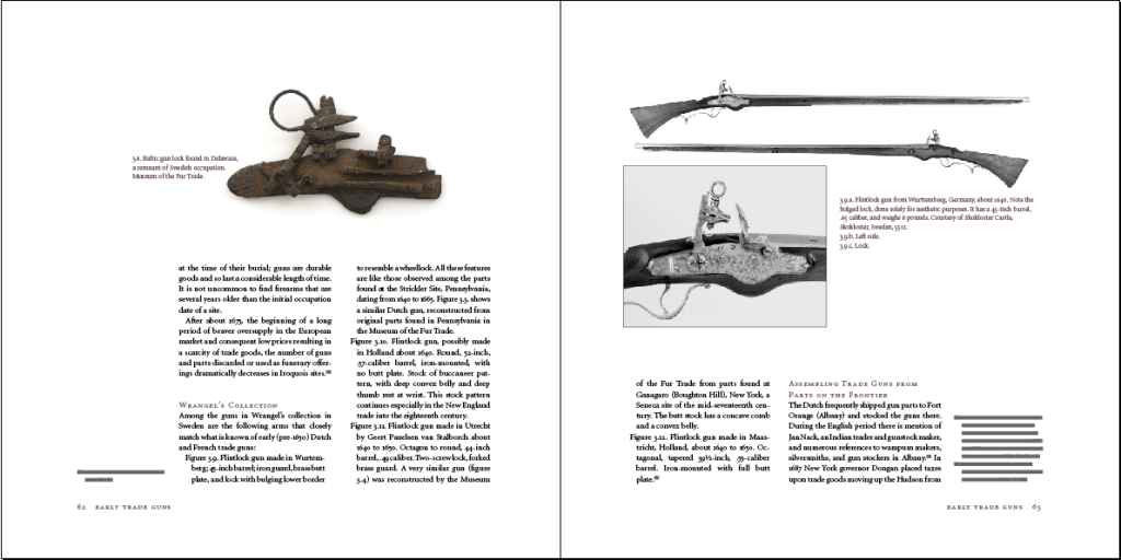
Page spread of Firearms of the Fur Trade.

The 584-page book includes approximately 1,500 illustrations. Ariane began working on the book in May of 2009. In anticipation for the increased workload, Ariane hired me that fall to process the photos. I resampled the dpi, changed colors from RGB to CMYK, and set the endpoints to make sure no photo was too dark or too light. Typically, the photos of the firearms were slanted or attached to one another, so I spent tedious amounts of time separating guns, making sure their lines were straight, and getting rid of any unwanted background color.

When I started, Ariane had the galleys completed, so I was able to place the illustrations in the appropriate chapters, fulfilling all preparatory steps that needed to be accomplished. We finished our process and sent the book to the printer after eighteen months of editing and design.

The book may be purchased for $135.00 at the Museum of the Fur Trade’s website.

Page spread of Firearms of the Fur Trade.

Book info: © 2011, Museum of the Fur Trade, Chadron, Nebraska · ISBN 978-0-912611-18-1 · Library of Congress Control Number 2010921749 · Printed in China by RR Donnelley & Sons Company

Posted in books | Tagged , , , , , , | Leave a comment

More Pantone!

“A good navy,” says a French woman with short blonde hair, “is going to fulfill the role that black used to fill, because black is now launching into another dimension.”

Continuing our Pantone-related postings over the last few months, this time with an article from Slate, “Sneaking into Pantone HQ: How color forecasters really decide which hue will be the new black,” by Tom Vanderbilt.

Posted in Uncategorized | Leave a comment

Heath Ceramics house numbers

Neutra 1 by Heath Ceramics

I wish these amazing new house numbers from Heath Ceramics would work on my house! The black backgrounds would go marvelously with my white house’s black trim. The fonts used were developed by House Industries, a font foundry with many mid-century-style typefaces, including Eames and Neutra (which comes with lots of variations–it’s a really nice, full set), which are used on the house numbers.

I have three beautiful pieces from Heath–a green vase and blue salt-and-pepper shakers–gifts from my excellent friends, who also appreciate Heath’s dedication to their craft. Hopefully a trip to their factory in Sausalito will be in store on my next visit to the Bay Area.

Posted in design resources | Tagged , , , , | Leave a comment

We work behind the scenes.

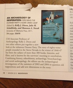
I was surprised and delighted to see a mention of one of my projects in the latest issue of the University of Montana’s alumni magazine. (I graduated from UM in 2001.) An Archaeology of Desperation: Exploring the Donner Party’s Alder Creek Camp includes writing from Will Bagley, who is one of my favorite western authors and a frequent collaborator, and Kristin Johnson, who wrote a couple of fantastic articles on the Donner Party when I was the editor of Overland Journal. Our role was limited to the typesetting, but it was a fairly complex job, with lots of tables and illustrations. The cover image is an old New Yorker image—a neat illustration of a microscope trained on a snow-covered trail.

Posted in books | Tagged , , , , , , , | Leave a comment

Fine books

From the New York Times:

Some things seem to designed to do their jobs perfectly, and the old-fashioned book is one. What else could be quite as efficient at packaging so many thousands of words in a form, which is sufficiently sturdy to protect them, yet so small and light that it can be carried around to be read whenever its owner wishes?

Indeed!

Posted in design resources | Leave a comment