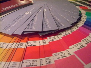
Beautiful Pantone colors made beautiful business cards for Capital A.
So what sparked this explanation of the Pantone color-matching system? Cookies. Pantone chip cookies, beautifully crafted by a blogger and designer in need of Christmas gifts for her colleagues.
Detailed cookie making isn’t part of our plan for this fall, but the use of Pantone’s colors are. Capital A’s business cards feature PMS 3025, a lovely shade of teal, and 536, a complimentary light blue. Our mailing labels also use PMS 3025, with the name of the company accented by the same shade it is written in, but at a tint of somewhere near 75 percent. The use of one color in two or more tints can save a lot of money. Any publication would be smart to use Pantone for this reason and many more, but let me explain just what it is first.
Historically speaking
In 1963, Pantone founder Lawrence Herbert noted a huge problem with color consistency in the graphic art community. I’m sure he dreamed in rainbow before designing the template of colors known as the Pantone Matching System, a book of standardized color. Although there are many guides, the one most commonly used, and in our possession, is the Pantone 4-color solid-to-process guide.
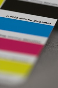
Photo of the Pantone guide for the basic CMYK model. Photo courtesy of Sean Girard.
CMYK is a subtractive color model that refers to the four colors used in most color printing: cyan, magenta, yellow, and key or black. The first three inks are keyed or aligned with the black plate. The colors are used in a fashion that subtracts from the white that is the background being printed on.
CMYK colors that are viewed on computer monitors, output devices, and printing presses can look different on screen than they do in print due to monitor and press variations. After a little experience with color inaccuracy in print, you’ll understand how helpful this is!
Keeping the pig in pigment
So why use Pantone? You can benefit from Pantone in so many ways (a lot of them dealing with minimizing stress) because you know your color is going to look great every time. There is no variation throughout the printing process. For example, if you are printing 10,000 copies, the color might not remain consistent throughout the run. Variations on the press can affect the way the colors look in the first 8,000 copies in comparison with the last 2,000.
Temperature and humidity can also affect press conditions. PMS colors guarantee consistent color even when influenced by outside elements as well as different types of paper. Swatch books allow users to know how their colors will turn out on coated, uncoated, and matte stock.
CMYK, when applied to a large, blank area, produces color in dots. If you look closely, the pattern is recognizable. Pantone diminishes this problem by making the color look smoother, without the dot pattern. Check out the back cover of a journal sometime and you’ll easily be able to find out whether it was printed with PMS or CMYK.
Capital A: tinkled pink by Pantone

Close-up photo of our use PMS colors on Capital A business cards.
Now that you know what Pantone is, and what they are capable of, you may be wondering why we are so intrigued. Remember those business cards I talked about? They were printed with only two colors, instead of the four colors that would have been used had they been printed with CMYK. Using less colors creates less expense for printing. And the mailing labels? Even though it looks as though there are two colors in the writing, there is only one. The emblem of the company is written in 100 percent color while the rest of the title was printed in 75 percent. When using more than one tint in the same color, it is considered one color. It’s like double-dipping with the knowledge that you’ll ALWAYS get away with it. So why not try it?
Pantone in InDesign
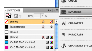
Screen shot of "swatches" panel.
PMS colors are easy to use in InDesign as well. Here is a quick demonstration on how to add them to your swatch panel.
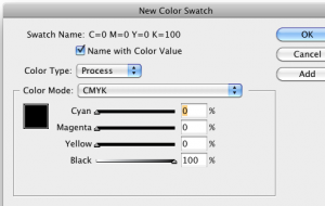
Screen shot of box that allows you to change color mode.
First, click on the Swatches panel to expand your options. Then select the small gray box at the top right. The box has three horizontal lines and a down arrow on it. Clicking this will give you several options. Choose “New Color Swatch.” A new box will pop up in the center of your screen. Now choose from the drop-down list that will appear after you click on “Color Mode.”
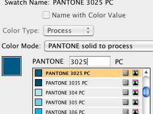
Screen shot of our choice: PMS 3025
From the long list provided, choose “PANTONE solid to process.” This is where it gets fun. A very extensive list of colors appears. You can either choose the one that you like best visually, or choose a color by the number provided as a guide. In this demonstration I am choosing PMS 3025, the color used in our business cards. Once you have decided on your color, click OK to return to your document. After completing all of these steps, check out your swatches panel. Beneath CYMK and the other basics you should see the color you just chose, as you can see in this screen shot. See how easy InDesign has made using Pantone in all of our documents?
Pantone’s branches and buds
Not only does Pantone provide guides for the computer world, but they have expanded their industry to play a role in nearly every area of our lives. Their Fashion and Home division covers a fashion color report for each season, announcing predictions for the hottest colors of the year. Products in those colors are provided for interior design, apparel, dishes, and more. For fall 2011 be sure you don bamboo, cedar, deep teal, or phlox. As for the 2011 color of the year, honeysuckle, a vibrant shade of what you might call watermelon or plumeria or just simply pink, claimed the prize. According to the Pantone website, the color is encouraging and uplifting and will elevate your psyche. So get your honeysuckle on!
A line of Pantone paint was established in 2006, after beginning a partnership with Fine Paints of Europe. Over three thousand colors can be found in their paint section. Color families, colors by number, and extensive palettes can be found online to help you choose the right color for whatever it is that needs a coat of shine. The paint line has been helped interior gurus and designers match paint choices with Pantone’s home design options and accessories.
Next time you purchase Tupperware or cheap garden furniture, keep in mind that Pantone works with plastic as well. They have found ways to produce their colors in opaque and transparent forms so that corporations are able to reproduce their colors after selecting, specifying, and manufacturing their goods.
Corporate tools and guides
Pantone didn’t stop there. They continued to add to their resume, adding tools and guides for the corporate world as well.
Color Cue 2 is one of the newest inventions. It is a portable device that is programmed with Pantone color data. When placed next to any flat surface, the device will identify which Pantone color matches the closest with the shade in question. Interior designers have found the product very helpful in ensuring everything in their design is coordinated.
Retail stole the show for TheRightColor, a system that enables retailers to provide a color standard for their products. The consumer’s shopping experience has been improved by the use of colors that affect them positively. Another important aspect of TheRightColor is its ability to minimize merchandise returns due to inaccurate color representation. Dole, among other banana growers, has found Pantone useful in fruit sales. Pantone has developed banana guides with an array of shades a banana may turn within its span of deliciousness. The perfect color for bananas is “buttercup,” in case you choose to go this route!

Pantone fan. Photo courtesy of Sean Girard.
Pantone Universe is a hub for lifestyle products designed with the hottest colors of the season in mind. Whether you need a new couch and curtains, a car seat, or a pair of honeysuckle pumps, Pantone Universe has it. Shopping the Universe line couldn’t be complete without the Pantone shopping color guide. This panorama of colors fans out for easy use and keeps you from needing to wipe your brow during the exhausting process of shopping.
Three main software products have also been developed by Pantone, each directed toward graphic designers, pre-press professionals, business users, Web developers and even Internet surfers.
Powerhouse Pantone
It seems as though Pantone has accomplished all they could think of since 1963. But wait, here is one more tidbit. Pantone provides colors for corporate identity and assists any industry requiring color accuracy. The Pantone Color Institute researches and provides information about how to use colors, how colors affect people, and much more.
T-Mobile is a great example of the use of color as a corporate identity. In their disclaimer, they announce that their logo, including the color magenta (PMS Rhodamine Red) and gray (PMS Cool Gray 7), are registered trademarks of their company. It has caused quite the controversy! Take a look.





An afternoon of history with a Spanish professor
As she answered the phone, all that could be heard was a dog barking, followed by a breathless “hello?” Laughing, she apologized as she took care of the dog and returned to the call, lively in every word and excited for the interview. Rose Marie Beebe is a renowned Spanish professor and exceptional editor, and she knew how to make a nervous interviewer feel comfortable. Quite the combo.
Cover for La Mezcla.
“I was so thrilled with the work on the two magazines!” she said, referring to La Mezcla and Nuevos Caminos, the Spanish publications we produced last fall (which I wrote about here and here.
Not only was Rose Marie pleased, but she said her students delighted in them as well. “The kids held them as if they were some kind of archival documents,” she said. “They turned the pages as if they were wearing gloves.”
Rose Marie made sure she spoke of how much she enjoys working with Capital A Publications, praising Ariane for her accuracy and attention to detail. She admitted that one reason why she wanted to do the Spanish magazines was because it would give her the chance to work with Ariane again.
“The quality of the design, it’s Ariane,” she said. “I knew it would end up like that!”
Cover of volume 22, no. 1, 2005.
Before producing La Mezcla and Nuevos Caminos, Ariane had the chance to work closely with Rose Marie on a number of publications. The Boletín: The Journal of the California Mission Studies Association, was the first, a design project started at the Arthur H. Clark Company.
“That journal was my dream,” said Rose Marie. “I always wanted to publish a scholarly journal, and with the Boletín I was able to do that.”
The journal ran for ten issues before coming to an end. Rose Marie likened the Boletín to what she accomplished with her Spanish class. She talked of how it was so awesome to see her students really jazzed about writing.
“I wanted them to have something to hang on to,” Rose Marie said.
Cover of volume 25, no. 1, 2008.
Concerned with the students getting bored, she looked at the magazines as something to persuade students to really work hard and look forward to an end result.
“I thought if they were going to be critiquing one another’s work, they might invest themselves in it and try to take more pride,” Rose Marie said. “It really worked.”
Twice a week for two hours at a time, her students worked hard on essays, ads, and anything else they wanted to include in the publication. She described the laughter that surrounded her in the classroom, not because students were messing around or not working with a purpose, but because they were truly enjoying the writing process.
Cover of Nuevos Caminos.
“I take writing and publishing really, really, seriously,” Rose Marie said. “It’s a lot of work.”
Rose Marie watched as students’ Spanish improved because they had to pay close attention to what they were writing. She said she’s going to teach the class again, and she hopes the school will fund her project next time.
“Unfortunately I ended up eating the cost myself, but my husband—he’s so wonderful—he said, ‘we’ll do it this time,’” Rose Marie said. “I figured, OK, I’ll eat it and then I’ll have something to show the administration, so I can get funds in the future.” She called this strategy “proof of success.”
Though she does plan on continuing the class, she’ll be taking a year off to translate a five-volume memoir.
“I’m just smiling as I’m thinking about it,” Rose Marie said. “I love deciphering the handwriting and translating it into English.”
She said she feels like a detective sometimes, using tricks and tips she’s learned through the years.
Bilingual from the beginning
Rose Marie was born in San Jose, and has lived there her whole life. She grew up in a bilingual home as her mother is from Cuba. Her grandparents lived across the street and spoke only Spanish.
“I grew up learning Spanish, not knowing that was something some people didn’t know,” she said. “It was kind of nice.”
Rose Marie said her grandmother was her mentor, and a wonderful one at that. She taught Rose Marie how to read Spanish as well as speak the language. Rose Marie credits her grandmother for inspiring her to become a teacher.
After high school, Rose Marie attended Santa Clara University, then Stanford for her Ph.D. She was hired at Santa Clara right away when she graduated from Stanford and has been teaching since 1978.
“I really enjoy teaching and I like doing different things in class,” Rose Marie said. “I like to enjoy myself in the classroom, and they’ll [students] pick up on that and enjoy what we’re doing as well.”
In the beginning of her career at Santa Clara, Rose Marie met her husband, Bob Senkewicz. As a professor of history, Bob compliments Rose Marie very well in both their marriage and in their work. They’ve been working together since the nineties and have completed a number of books together.
“We collaborate on those two aspects [history and Spanish] and produce articles or books,” Rose Marie said. “We’ve moved into one another’s field through the years.”
Rose Marie said she believes they are a great pair. Bob speaks fluent Spanish, and she knows much more about history since working with him. She giggled when she admitted that Bob cannot get past a New York accent while speaking Spanish.
Previous collaborations
We also worked with Rose Marie on a collection of essays from a presentation that was given at the Santa Barbara Mission Archive–Library. The essays present new scholarship that is being done on Junípero Serra, a priest who was negatively portrayed because of his mistreatment of Indians.
Cover of "To Toil in that Vineyard of the Lord": Contemporary Scholarship on Junípero Serra.
“We’re trying to use primary source documents and let those words speak for themselves,” Rose Marie said. “He maybe didn’t always have a favorable view, but we’re trying not to be biased.”
Next Rose Marie and Bob worked on a documentary series, Early California Commentaries, that follows along the same lines as the previous essays. Their goal is to get primary documents accessible to scholars, researchers and anyone else interested in the topic. Pairing with that series is a monograph series, Before Gold: California under Spain and Mexico, which is also published by the Arthur H. Clark Company and designed and typeset by Capital A. The first volume, Vineyards and Vaqueros: Indian Labor and the Economic Expansion of Southern California, 1771-1877. The second volume, Contest for California: From Spanish Colonization to the American Conquest, is expected to be printed soon.
“We’re trying to bring out new things,” Rose Marie said. “We’re trying to be cutting edge.”
Rose Marie mentioned seeing a review for Vineyards and Vaqueros in the fall 2011 issue of Southern California Quarterly, another Capital A publication for the Historical Society of Southern California. A review of the first volume of the Early California Commentaries series, with Anza to California, 1775-1776: The Journal of Pedro Font, O.F.M., ran in the winter 2011-2012 issue of the journal as well.
Rose Marie talked about going to a reading by the curator of history of the Oakland Museum. Her voice rose in delight as spoke of how the reader quoted from two of her books. “This is so cool; this is why we do what we do,” Rose Marie said. “People can get that primary source and use it in their research.”