New Overland Journal

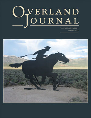
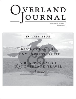
spring 2011 Overland Journal mailing wrapThe spring 2011 issue of Overland Journal came out last month; here is a look at its mailing wrap. We started using a mailing wrap on OJ a couple of years ago. Prior to that, we did the mailing address and postal information on the back cover. However, the U.S. Postal Service proved to be really hard on our journals in transit, and readers were receiving copies with their covers barely hanging on. The mailing wrap–basically an additional white cover made of some non-coated paper stock–has helped solve that problem. The design for it is fun to do, in that we get to be a little creative in designing the text (I love to do a big swirly ampersand wherever possible!). It’s printed in one color, and we have the cover image in grayscale, either lightened with black text or darkened with white text.

spring 2011 Overland Journal coverAs you can see, the masthead and image are aligned on both the wrap and the cover, so when you turn the wrap page, voila! the lovely full-color version of the photo. This photo of a Pony Express marker in Schellbourne, Nevada, is by Melody Miyamoto, whose article on traveling the route of the Pony Express (celebrating its 150th anniversary this year) is featured in this issue. The background and masthead colors are taken out of the image; I am particularly fond of the near-black with cream (and just happens to be the paint scheme on one of my favorite houses in my neighborhood!). I was concerned that the back cover, which is a solid near-black, might end up with banding, but it looks just great.

Posted in journals | Tagged , , , | Leave a comment

A Closetful of Upton Dust Jackets

As mentioned last week, the reprint of The Custer Tragedy: Events Leading Up To and Following the Little Big Horn Campaign of 1876, has arrived. Quite pleased with how the dust jacket turned out, we wanted to share with you the rich colors and elegant layouts that have graced the covers of Upton books for the past six years.

While employed at the Clark Company, Ariane worked on the anniversary book, The Battle of the Little Big Horn and Custer’s Last Fight.

Posted in books | Tagged , , , , , , | Leave a comment

Coming in with Spring

We just received the reprint of The Custer Tragedy: Events Leading Up To and Following the Little Big Horn Campaign of 1876. The year 1939 was the original printing of the book. The new dust jacket will be previewed next week along with a gallery of Upton dust jackets from the past six years.

Posted in books | Tagged , , , | Leave a comment

Before We Edit and Design

Create a Length estimate

Before the editing and book design process begins, we a provide a length estimate for our clients. This gives us an idea of the amount of work ahead of us as well as a cost estimate for ourselves as well as the publisher. Recently, I have completed several estimates, which can be extremely tedious, but are very important nonetheless.

How to count: More than 1, 2, 3

A length estimate begins by counting characters including spaces. We use Microsoft Word’s word count, and log the count on a spreadsheet in Open Office. The part that takes a little extra time is the extracts, which are common in the historical books we work with. These are counted separately from regular text, because they are set at a smaller size than the regular text and so take up less space within the book.

The word count is not only broken into regular text, extracts, and notes, but by chapter as well. Our spreadsheet contains the preliminary information, acknowledgements, table of contents, and sections for each chapter. Then there are slots for the bibliography, index, and author biography sections as well.

Screen shot of recent spreadsheet

Once all the word counting is complete, we factor in the number of pages that illustrations require also. Now we have an idea of how many pages will be in the book, and can send a bid to the printer or publisher.

Posted in books | Tagged , , , | Leave a comment

Overland Journal Galleys

We have received the text for the articles and reviews for the Overland Journal issue, Spring 2011 and today created the galleys, which are the first round of proofs. InDesign allows us to set up templates, styles, and guides that simplify the consistent creation of galley proofs.

Step one: Character styles

First, I open the template and use the Place shortcut (command d) to grab the file I want. After placing the text in the template, I am ready to begin making changes. Find/Change has become my best friend lately. This allows me to make many changes rapidly. I use it for italics, note numbers, double spaces, ellipses, and many other errors that are common in text and need to be fixed.

Screen shot of Find/change tool

Step two: Paragraph styles

Next, I am ready to use my paragraph styles to change all text into the correct styles. The paragraph styles have already been set up, so all I need to do is click the one I want to use. The styles that we use range from basic, which is used on the majority of the text, to extracts and captions. When setting up the galleys for reviews, there are even more styles than in the articles, including ones for a reviewed book’s title, author, book info, and review author as well.

Screen shot of paragraph styles tool

Finishing up

After completing the basic steps – the ones the computer helps me with, I like to go through and manually check for any errors that catch my eye. Even though the paragraph styles and Find/Change are very efficient, every article is different and might have aspects that aren’t covered by our basic workflow.

Posted in journals | Tagged , , , , | Leave a comment

Spokane archive online

The Northwest Room at the Spokane Public Library is putting some of their extensive photo archive online. Only a fraction is up so far, but that sample is a fantastic look at Spokane in its early days. I particularly enjoyed browsing through the photos of Liberty Park, which is near my house. It was designed by the Olmsteads and originally spanned over twenty acres. The construction of I-90 ate up most of the park, but a small section remains, and I drive past the rubble of some of the buildings every time I go to the post office.

Other categories of the library’s online photo archives include the 1889 fire, some of its famous homes, and the Spokane River. Having these materials online is a boon to researchers, but it will also make it more likely for non-historians to come across them—the collection is featured on the front page of the library’s website, and it’s much easier to browse through them than to make a trip to the downtown library during the Northwest Room’s daytime hours. I’m looking forward to seeing more of the online archives of my current city’s past.

Posted in research sources | Leave a comment

Diggers, Constables, and Bushrangers: The New Zealand Gold Rushes as a Frontier Experience, 1852–1876

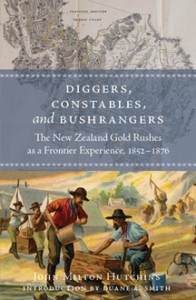
Images on the dust jacket were taken from the author's extensive collection of rare books and ephemera. All illustrations within the book also come from his collection.

It can be difficult to choose which books to talk about on this page when each of them brings such different aspects and dynamics to our work. One of the many that we at Capital A proudly designed and produced in 2010 is on the New Zealand gold rush.

The preface and introduction of this book lend important information about New Zealand as well as the author, John Milton Hutchins. Hutchins is the first non–New Zealander to write a historical book on the New Zealand gold rush, which took place about twenty years after California and Australia experienced theirs. Hutchins writes in a traditional viewpoint, making this book very informational but easy to read. The book touches on a broader understanding of New Zealand and “the story of the entire westward and worldwide movement” and informs the reader on “social, political, native-relations, transportation, urban environmental, and mining history” (p. xiv).

A New Industry

Whaling lost its popularity as “gold fever” blinded citizens to all other opportunities. Farming, ranching, and merchandising were discarded as professions when the worth of gold rose to sixteen dollars per ounce and was the “immediate equivalent to cash” (p. 3).

As more people became involved, the gold rush slowly began to bring change to New Zealand. The belief that every man could strike it rich brought the democratic dream into view. The diversity of the population expanded as men and women from all over the world came to New Zealand to pan for gold: “Those newcomers included not only gold diggers of every color, creed, and nationality, from such locales as Australia, the United States, Canada, and China”(from the dust jacket).

Invention

Panning was brutal work and led to the search for tools to ease physical demands. Out of necessity, the rocker and the sluice box were soon invented, creating a much more efficient workflow. Gravel, sand, and dirt were shoveled into the rockers and boxes, then washed with ladles of water that carried away all the lighter elements, leaving gold on the bottom. This process proved much less tedious than previous methods, and eventually lead to the introduction of the Long Tom, which was just a larger form of the two previous tools.

Soon gold was found in quartz veins, and the advent of hardrock mining required more advances. Machinery and technology were developed to blast through rock, but they required large amounts of money that most miners had yet to acquire. In effect, the mining industry moved from small groups to large corporations to alleviate financial struggle.

Learning from past mistakes

The extreme violence and crime that resulted in California and Australia from the gold rush acted as a lesson for New Zealand. When gold was found in the islands in the 1850s, New Zealanders were well-prepared.

They took preventative measures to keep crime rates at a minimum while still benefitting from the gold. Crime still occurred, but not nearly as wildly as it had in California or Australia. The way the government was split into nine provinces was beneficial to the gold industry. Each area had its own legislative government, and could base their laws and regulations on whatever they chose. This later brought harm to the unity of the nation in the 1860s as each province chose to act “largely on their own when it came to handling crises, whether due to native warfare or to the discovery of gold” (p. 24).

About the book

D, C, & B was produced in an edition of 1,500 hardcover copies. The book’s dimensions are 6-1/8 x 9-1/4. Included in the 357 pages are an introduction by Duane A. Smith, 19 illustrations, a bibliography, and an index. The book was published in 2010 in Lakewood, Colorado, by Avrooman-Apfelwald Press.
Posted in books | Tagged , , | Leave a comment

Choosing the best image file format

Last year we worked on a book with around 1500 of photos and other illustrations. Picture files can take up a ton of storage space and the quality of the photo can be affected by the file format as well. Knowing the right file format to us is important in ensuring we have the highest quality image that is needed.

Jpegs

Jpegs are probably the most common type. These are compressed files, making them smaller and therefore easier to upload onto the internet or send in an e-mail. Lossy compression is used with jpegs, meaning the file will lose some of its image data each time it is saved. The more compression applied, the more data is lost, making this a bad option for editing but a good option for general personal use. Digital cameras are generally set to save images as jpeg files, so most of the modern images that we work with here have to be converted to tiff.

Tiffs

Tiff files are generally the standard for publishing or printing. These files can either be compressed or left uncompressed. When compression does occur, it’s in a small amount so as not to lose any image data.

Although tiffs seem like the optimal file type, for everyday, non-publication use, jpegs are probably the better choice. Tiffs take up a lot of storage space compared to jpegs and aren’t as easily uploaded online or sent via e-mail due to their large file size.

Psd: Our New Choice

At the InDesign seminar Ariane and I attended last fall, our instructor spoke of the benefits of using native Photoshop (psd) files instead of jpeg or tiff. Tiffs tend to be fairly large when their layers aren’t compressed, and psds can be saved without the bulk. We have started experimenting with this type of file in our current projects and so far it has been successful.

The Results

For best printing results, saving the file as a tiff first will avoid multiple compressions compared to saving it as a jpeg. Definitely do not compress the image more than once, as multiple compressions degrade the image. At Capital A we accept all of these file formats, as long as the resolution is high, giving us a quality image to work with.


Posted in design resources | Tagged , , | Leave a comment

Right-o.

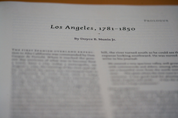
Page from Doyce Nunis's prologue in <I>The Development of Los Angeles City Government</I>

Page from Doyce Nunis's prologue in The Development of Los Angeles City Government. Photo by Sean Girard.

Brilliant historian, prolific author, and long-time editor Doyce B. Nunis Jr. died last weekend. While at the Clark Company, I worked with Dr. Nunis on Southern California Quarterly, which he edited for over forty years, until he turned over the reins to Merry Ovnick, who had been his book reviews editor. Over the course of about three years, I did hours’ worth of his corrections to his authors’ manuscripts. This was invaluable for me: seeing what an experienced editor did and—did not do—taught me volumes.

His editing wisdom saved my bacon on the second-longest book I’ve ever worked on: The Development of Los Angeles City Government: An Institutional History, 1850–2000. One thousand and thirty-eight pages long, this two-volume history had twenty-four chapters and seven appendices. Dr. Nunis was on the project’s board of editors and also wrote the prologue.

With nineteen authors coming from very different fields of study—and, therefore, documentation formats—all of the footnotes did not follow my beloved Chicago Manual of Style. I did not even know where to begin in formatting the thousands of notes consistently throughout the book. Finally, in despair, I called Bob Clark, who said only, “Call Doyce.” Doyce told me to do nothing–it was not necessary to make each chapter match the next; all that was important was that each chapter be consistent within itself so that the reader would be able to find the source being cited.

Wow! So simple! And practical! He did not even hesitate; work on over hundreds of issues of SCQ and his many books made him the voice of editorial reason. He knew what was necessary—and feasible on a short schedule—and did not get bogged down in a general rulebook.

This is just one of several happy memories of Doyce, which include his dapper phone sign-off: Right-o.

Posted in historians | Tagged , , | Leave a comment

2010 by the numbers

May your days be merry and bright.
This year was my busiest one yet, and while counting up the number of books, I thought I’d look at some more numbers. It turned up some interesting data:

  • 6,024 pages typeset
  • 1,896 illustrations included in publications
  • 18 books worked on, 15 of which are complete
  • 11 x 11 inches: the biggest trim size
  • 8 journal issues completed
  • 6 x 9 inches: the smallest trim
  • 5: the version of the Adobe Creative Suite that we are moving to
  • 4 books copyedited
  • 3 business trips: Norman, Oklahoma; Elko, Nevada; and Incline Village, Nevada
  • 1 book indexed
Posted in Uncategorized | Tagged , | Leave a comment