Upcoming issue of Overland Journal

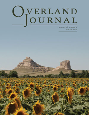
The winter issue of Overland Journal is at the printer and will be mailed out next week, so I thought I’d share the cover, which I am particularly fond of. The photo was taken by Roger Blair near Gering/Scotts Bluff, Nebraska, where the Oregon-California Trails Association held their annual convention a couple of years ago.

The image shows Oregon-California Trail landmarks Courthouse Rock and Jail Rock, which could be seen from three days of overland travel away and were the first landmarks that emigrants would see as they made the trek. The remnants of eroded plateaus, they are now listed on the National Register of Historic Places.

This image was shot as a wider view, but because it was done at a high resolution, it left me the flexibility to crop out the sides and make the rock formations much more visible, while keeping the image large enough to take up the whole cover. (I did have to add a little transparent gradient fill to the sky so that I could leave in as much of the sunflower foreground as possible.) Just another example of why the highest resolution is vital to flexible design!

Posted in Uncategorized | Tagged , , , | Leave a comment

APA Style vs. Chicago Style

At Gonzaga University, most professors require their students to use APA Style in their papers. APA attempts to focus on maximum precision and clarity as writers attempt to portray their ideas on paper. However, since I’ve been working at Capital A, I have been using The Chicago Manual of Style as a guide for all editing work. If you’ve been told that both styles are the same, you have been misled. Chicago style and APA style differ substantially from one another.

The Difference Is in the Style

Because the work I do at Capital A is very different from anything I write at school, I haven’t found many blaring contradictions while working. Despite this, I have been able to become familiar with both styles and notice the small differences in the guidelines of each. The two styles offer different emphases on select aspects of writing. I have found APA style to stress how to avoid plagiarism as well as how to correctly cite sources, which is why it is commonly used in universities. Chicago style offers a well-rounded base for all categories of writing, without focusing on one more than the other. Chicago style is tends to be used more in the publishing world. APA style was originally created by a group of scientists who hoped to establish a common form of communication.

What I’m Using: A Website and a Manual

At Capital A, I use the online Chicago Manual of Style website to help me out. In class, I have the actual APA Style Manual. Looking up answers for my inquiries while writing is tedious using the manual. Various Gonzaga journalism professors advise students to read through the manual often, and get familiar with the rules so they don’t have to constantly refer to the book.

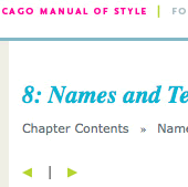
Screen shot of the creative colors of Chicago's online Manual of Style.

On the other hand, Chicago’s website has been an awesome tool. It is extremely well organized and easy to read. Maneuvering through the material has been made user friendly with comprehensible titles and headings. There is nothing more frustrating than going on a website, knowing the information you’re looking for is there, and not being able to find it. Of course the lovely turquoise and pea green text with hot pink accents on Chicago’s site allows for a pleasing experience as well.

I know I can’t end this blog without enlightening you with an interesting tidbit that I’ve learned by flipping through the pages of style this year. Did you know that geese are called Canada geese, not Canadian geese? A goose can only be Canadian if it is from Canada, and we have no way of knowing that. So next time you come across a Canada goose remember, he might be American.

Posted in design resources, research sources | Tagged , | Leave a comment

Putting a Library of Congress image to work

Just for fun, I thought I’d post this CD cover that I designed for a friend who had a long road trip ahead of him. I’m using the image that I discussed here.

Posted in other designs | Tagged , | Leave a comment

Turkey Day has almost arrived!

This week I won’t be at Capital A as I am heading home for Thanksgiving! My family has already warned me of the fresh snow they have been waking up to, so I might be in for a white holiday. I hope everyone enjoys their family and friends on this occasion. I look forward to posting more after the break!

Posted in Uncategorized | Leave a comment

Green, White, and Red review

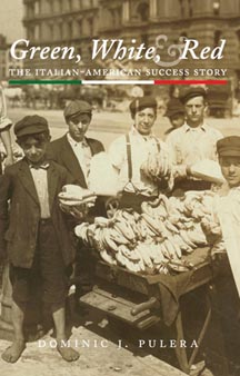
Green, White, and Red coverIn early 2009 I completed design and production work on Green, White, and Red: The Italian-American Success Story by Dominic J. Pulera.

Dominic recently sent me copies of the 19 August 2010 issue of The Italian Tribune, which contained a review of the book, part of which reads, “Green, White, and Red takes an in-depth look at all of the twists, turns, road blocks and smooth paths taken and met by the Italian immigrants on their journey to a better life for their families. . . . Pulera did research of the Italian population in all of the fifty states and also interviewed hundreds of people so that his story would draw from countless voices, telling this tale in unison.”

Posted in Uncategorized | Tagged , , , | Leave a comment

InDesign Secrets Live, 2010 Tour: Spokane

At the InDesign Secrets seminar last week, speaker David Blatner informed us that the class was going to be all about efficiency. The class was sponsored by InDesign Magazine and took place in the elegant ballroom of the Lincoln Center. While I’ve had some awesome hands-on work with the program, I was also very excited to find out new things that I’ve missed. And as it turned out, there were quite a few tips that would have made my job a lot easier in the past!

The seminar was broken into seven sections with a lunch break in between. I went knowing that the morning sections sounded awesome, and planning on staying as long as my interest held. It turned out that Blatner was a very engaging speaker, and he dispersed his information throughout the seminar, not necessarily following the order on the course guide. While this kept us on the edge of our seats, it also kept us in our seats, unable to leave because who knew what we might miss?

Efficiency

After an 8:30 a.m. registration, we were ready to delve into the topics on our course guide. The first topic was the top ten things Blatner thought every InDesign user should know. This section focused on keyboard shortcuts, many of which would have helped and will help me in the future. Blatner stressed the importance of keeping your hands on the keyboard in order to maximize efficiency.

Instead of moving from keys to mouse and back again, Blatner suggested toggling between panels. To get into the main panel, type command + 6. From there you can tab through the different sections such as font style, font size, etc.

Blatner also stressed the importance of setting the preferences of InDesign to what works best for you. There is no right or wrong way to do this. Keeping things organized or arranged in your own way is what is important.

Tabs

Every time I have to fill out some pesky file that asks for name, address, phone, etc., I get ahead of myself and tab too many times. I cannot describe how frustrated I am then when I have to remove my hands from the keyboard, grab the shaky mouse, and click on the box that I missed. It’s not that I’m being lazy, it’s the monotony of filling out another generic file that gets to me. As it turns out, the “backspace button” for tabbing is simply shift + tab. How simple! In similar fashion, we all know that command + a is select all, but did you know that command + shift + a will deselect everything?

Mathematically Comprehensive

Another aspect of InDesign that really surprised me is that the program can do math. Some computers are set to inches, centimeters, picas, etc. While using InDesign, you can not only add and subtract to fdecide on the size you want your images, or how far from the border they should be, but InDesign will convert the metrics for you. For example, if your screen says an image is 2in wide, and you want it to be 2in and 5 centimeters, you would just put +5cm in the box. The program will automatically convert the size for you and apply it to whatever you selected.

Next Style

I spoke earlier of some of my favorite features of InDesign, so I was definitely excited to learn about more features and possibly discover a new favorite. For me, the Next Style option was very intriguing. Although in some instances it wouldn’t work, it would definitely save a lot of time if set up correctly. Next Style allows you to type different formats in succession to one another, and not have to manually click each time you want to change formats.

For example, if you are writing news stories, you might set up a “news” style. This way, when you start typing, you will automatically be in “Title” mode. As soon as you hit enter, your format will change to “byline” and after striking enter a second time, you’ll be in “date” style.
If you don’t want to set up such strict guidelines, you can also use Quick Apply to tab or arrow through different styles.

Proceed with Caution

Blatner cautioned us about InDesign as well. The program is so advanced that you have to be careful to tell it exactly what you want it to do. For example, if you want to add a new swatch, you have to make sure nothing in your current file is selected, or you will change your default, and everything that is set to default–possibly everything on your screen–will change to that swatch.

GREPs work in the same fashion. They are a great way to quickly find all similar words or phrases in a text, but you have to make sure to tell InDesign exactly what you want it to look for.

Because my time at work is limited to only two days a week, the emphasis on efficiency was a great topic for me. After attending the seminar and becoming more comfortable with Indesign, I hope to be able to accomplish a larger amount of work in the same block of time!

To discover more InDesign tips we’re using and practicing, click here!

Posted in design resources, research sources | Tagged , , , , | Leave a comment

One busy Tuesday!

Ariane and I attended an InDesign seminar yesterday at The Lincoln Center. The class was put on by InDesign Magazine and took a look into various different aspects that the program has to offer. Next week I plan on posting one (maybe two!) blogs about the new options I learned while attending the seminar.

Posted in Uncategorized | Leave a comment

Typefaces get noticed

Sample of Warnock typefaceThe New York Times this week has an article on the different typefaces used in this year’s election signs. When I was in California a couple of weeks ago, Carly Fiorina’s campaign signs caught my eye. They looked hot pink–a remarkable choice in the usual primary-color palette of political signs–though a Google search tells me that they are actually red. (Maybe they were just faded from the hot Sacramento sun.) The other thing that I noticed was the typeface. Apparently it is Futura Light, which isn’t a great choice, with the really round ‘c’ and ‘a’ versus the really tall and thin ‘l’, but I did enjoy that someone was using something at least a little different from the too-common Impact and the like.

In other typeface news, I just got a new typeface, Warnock, for a new book. It is a great complete set: small caps, alternate characters, old style figures (why don’t more fonts come with these?), Cyrillic characters (one of my requirements, as small parts of the book are in Russian). It’s a much more modern (relatively!) typeface than I usually use. Adobe has a really nice specimen book available for download as PDF that shows the different weights and all of the characters that are included. With all of the swash caps and alternate characters, it’s a nice reference, though the same information will be available in the much-used Glyphs panel in InDesign.

Posted in Uncategorized | Tagged , | Leave a comment

Speaking with the Publishers: Richard & Frankie Upton

“This is pretty exciting right now,” said Richard Upton as I spoke with him this afternoon. Richard and his wife Frankie allowed me to conduct an interview via telephone to get an inside scoop on the couple as well as the ins and outs of their company, Upton and Sons Publishers/Booksellers.

Established in 1973, the Upton collection of books focuses on frontier military, western art, and the Northern Plains Indians. The company produces three to four volumes annually and issues catalogs and monthly mailers of Western Americana to help advertise the company as well as new and upcoming books. Richard said they try to do something every month, whether it be a mailer or just a postcard. “If you don’t send something for too long, people move away and you lose contact,” he said.

The company’s location in El Segundo, California, right next to Los Angeles International Airport, has provided some benefits to the business. Occasionally people will call if they have an extensive layover and the Uptons will take them to lunch or take them to their company. Richard says, “It’s nice to connect the voice over the phone with a face.”

Embracing Montana & the Battle of the Little Bighorn

Both Richard and Frankie enjoy playing the trumpet. At a college group, their similar musical talents allowed them to meet one another. After Richard married Frankie and discovered she was from Billings, Montana, he began his personal history lesson.

Although Richard expresses definite interest in Montana, he and his family are from Michigan, where he recalls a childhood past with his dog Skipper. Once Richard began to learn about Frankie’s lineage, he was hooked.

Frankie’s grandfather was in the cavalry at Fort Custer, and after visiting the fort, the Uptons realized the Little Bighorn Battlefield was only sixty miles away. Frankie’s mother showed them her home in Hardin, Montana, which was very close to the battlefield as well. This provided Richard a spark of interest that he decided to pursue with the assistance of his wife.

When the Uptons first began their business, Richard did the research, and Frankie typed their findings on a typewriter. They have found computers to be much more adequate for time management and easy corrections.

They also started out visiting Montana every summer and having book sales and signings there because native Montanans were most interested. Later, they realized that publishing the books might provide monetary gain, as well as a fun challenge. After losing one of their two sons in 1979, Richard and Frankie were provided with even more motivation. Frankie said, “We realized we needed to put our energy into something we could build upon.”

Most often, the Uptons will find an expert on the topic and ask them to write a book for one of their collections. “Most people are flattered and willing to do it,” said Richard. “Sometimes they write more than one.” Although some authors come to Upton & Sons with very promising work, Richard says he prefers to work with people he knows.

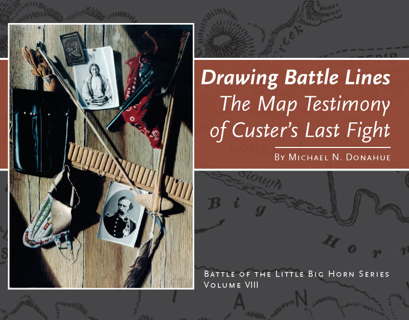
So far, the Battle of the Rosebud has been the most popular book for Upton & Sons. Each printing produces 1,000 copies, and the book is already in its fourth printing. It was written by Neil C. Mangum, a historian at the Little Bighorn Battlefield. Richard believes that those sales will be surpassed by Drawing Battle Lines by Michael N. Donahue, a seasonal ranger at the Little Bighorn Battlefield. This book is in its second printing, but it is ready for its third according to Richard.

Although they don’t face many obstacles, Frankie and Richard agreed that they don’t have enough time in the day to get through everything they would like to. Frankie says they have moved to working on just one manuscript at a time. “We depend on one another,” she said. “We love the business; it’s been a good friend to us.”

Despite their full schedule, Richard and Frankie find time for their two grandsons in town. They also try to go to Montana as often as they can, but their business has evolved into a full-time job, and they find it difficult to just pack up and leave.

The Uptons are currently anticipating the arrival of 1,055 copies of First to Arrive on Custer’s Battlefield with the Montana Column to be delivered in a couple days. They have endured a lot of rain lately and are hoping the day of book arrival brings sunny weather.

I found it refreshing talking to two people with so much knowledge and passion for the state I grew up in. And, due to her past job as a telephone operator in Montana in the 1950s, Frankie knew about my hometown, Eureka!
Posted in books | Tagged , , , , , | Leave a comment

My Transition to Adobe InDesign

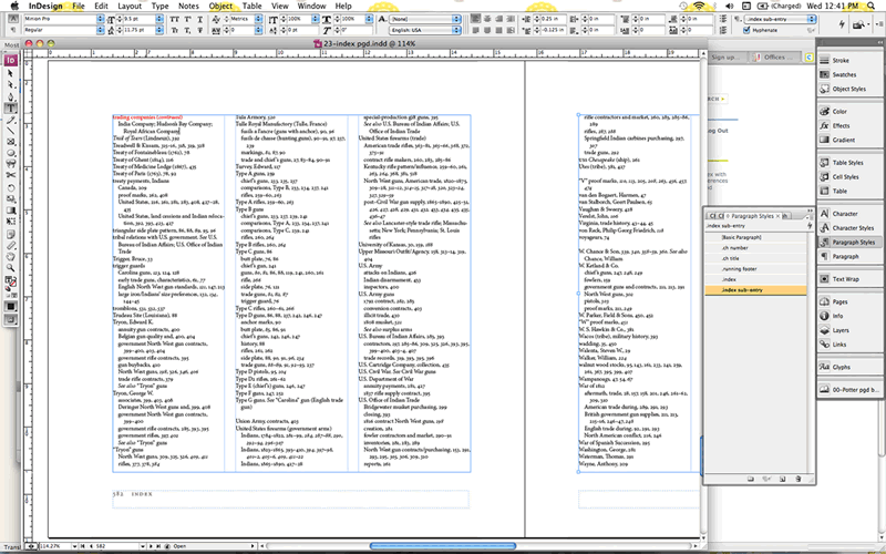
This is a screen shot from a current piece of work. Note the panel on the right.

If you’ve ever tried to work with InDesign, it is likely you got frustrated at some point and gave up. The program is very unique from those that most of us have experienced. The courses we took in school didn’t cover something as complex as InDesign, and we became accustomed to Word, Excel, and PowerPoint. I however, did get the chance to work with InDesign for my high school newspaper, The Pawprint, when, during my senior year, the news staff made the decision to switch from Microsoft Word to Adobe for a more sophisticated design in our paper. Despite my adviser’s good intentions, we were never given any instruction and often found ourselves completely frazzled. You can imagine my anxiety when Ariane told me we would be working in InDesign. Yikes.

Although I clearly had preconceived notions about the program, once given instruction, I was able to pick up the quirks of InDesign fairly quickly. It’s not the program that’s tricky, it’s the fact that we’ve learned something different, so the new fashion isn’t ingrained in us as Word is. So let me tell you a little about InDesign.

InDesign is a software application created by Adobe Systems. It developed out of PageMaker, another Adobe application. QuarkXpress stole the limelight from PageMaker by 1998, so Adobe was forced to create a new, more powerful program.

InDesign gives you complete control over your publishable work on either print, online, or mobile devices. Although there are currently several different versions of InDesign, we use the CS3 version. Adobe encourages users to browse through their website to find the system that best fulfills their needs.

One of my favorite aspects of InDesign are the panels on the right side of my screen. It is so handy to have all the tools I need close at hand. I mostly use the pages, paragraph, and character style buttons in that area. While working at Capital A, I have been exposed to text options like small caps, which can be found there. I’ve discovered my love of the swatches button, which allows me to put notes in color while editing online. This is a great way to draw attention to something that you think is particularly important and will need to go back to. Recently I added the Glyphs category to my right-hand toolbar. This provides a quick way to add superscript numbers or fractions if you are using an Open Type font that provides these characters. To read more about OpenType, click here.

There are classes and tutorials available for Adobe InDesign, online and otherwise, and many users choose this option for quick instruction. Although I will not disagree with that choice, I can’t say that the memorable experiences I’ve had learning through trial and error are something I regret. I continue to learn something new every time I work in the program, and enjoy the hands-on aspect. And, of course, having Ariane there to guide me is useful in times of extreme frustration.

Posted in design resources | Tagged , , , | Leave a comment